Black Mirror: Designed to Distract
When product design is too optimized for conversions, it stops being helpful and starts being manipulative. From Zepto's billing screen to sneaky free trials and dark patterns, users are catching on.
Good UX is supposed to feel invisible. Helpful. Intuitive. But somewhere along the way, "user experience" became about making sure the user doesn't notice - until it's too late.
That's not design. That's misdirection.
One recent example that blew up online? Zepto.
From the outside, Zepto has a slick, polished app. The delivery experience is seamless. Search is fast. Design feels modern. But look closer at the billing screen - and you'll see how beautiful UI can hide broken trust.
In a recent bill (see screenshot), a user was charged ₹1242.64 for items. Seems normal. But then:
- ₹ 95 for Item Handling
- ₹ 60 for Fulfilment Fee
- ₹ 40 for Platform Fee
- ₹ 74.37 in GST on top of all the above
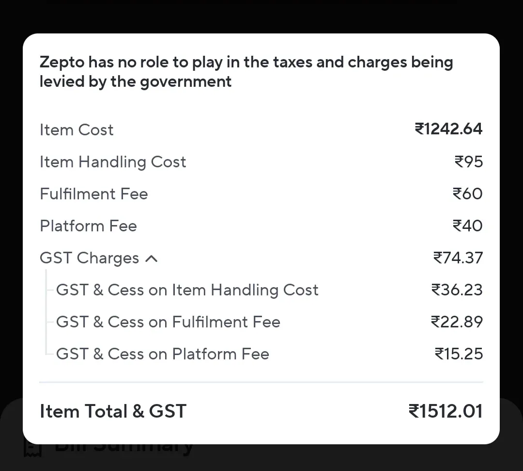
The GST isn't just on the item. It's charged separately on every fee - including the platform fee.
All of it is legal. But the problem is in the way it's designed. Everything looks clean. Minimal. No alerts. No friction. Which makes the total feel justified - until users do the math.
That disconnect is where the trust breaks. The reaction? Users noticed.
Not just on X or Instagram - but on Reddit, where the subreddit r/FuckZepto now has over 30,000 members, dwarfing the actual Zepto subreddit.
This isn't just outrage. It's what happens when design hides instead of explains. When friction is removed from the flow, but added back in the price.
But Zepto isn't alone. Another classic example is Booking.com.
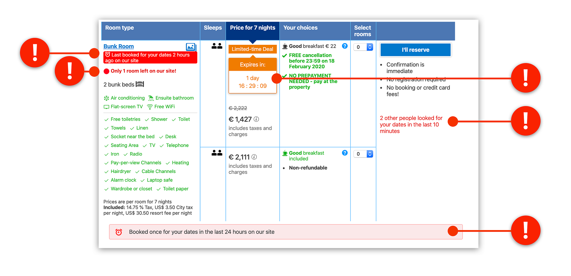
What looks like a helpful, comparison-first UX is actually a maze of urgency nudges and fear-driven persuasion tactics:
- "Only 1 room left!"
- "Booked once in the last 24 hours"
- "2 other people are looking at this hotel"
- Countdown timers that pressure you to book fast
It's stress UX, not user UX. Designed to convert, not to calm.
You'll find similar patterns across the internet:
- Amazon automatically checking boxes for faster, pricier shipping.
- YouTube Premium trial flows that hide the cancel link under layers of clicks.
- Instagram pushing Reels with addictive scroll mechanics and no clear off-ramp.
- Travel sites using urgency nudges like "Only 1 room left!" even when it's not true.
- Food delivery apps showing discounts up front, but burying service charges deep in checkout.
These aren't design bugs. They're business features. And they work, until users feel tricked.
When UX Becomes Too Good
A good interface guides. A great interface disappears. But a manipulative one distracts you from what matters.
These aren't "bad design."
These are intentional dark patterns - optimized for conversion, not trust.
And the worst part? They work. Until they don't.
What We Forget
- Trust is UX. If your interface feels deceptive, your product feels broken.
- Clarity > Cleanliness. Don't hide fees behind typography.
- A good experience is the whole experience - not just how fast the user gets from A to B, but how they feel after they pay.
Booking.com and Zepto are not a bad products. But it's a great example of what happens when UX gets too clever and not clear enough. In the race to reduce friction, don't forget what you're rubbing away: honesty.
Design is a mirror. If the user walks away angry, it's not because they didn't understand. It's because they finally did.
How to Do It Right
- Make fees transparent before checkout.
- Let users opt-in, not opt-out.
- Use friction as a feature where trust is critical.
- Replace urgency with clarity.
- Build for long-term trust, not short-term conversion.
You don't have to choose between great business and great UX. You just have to choose not to treat your users like targets.
Build with respect.
Build for repeat use.
Build with your reputation in mind.
Good UX isn't invisible. It's just honest.